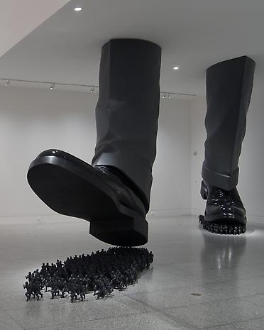
Art Critic Responses:
One of the standards: Envision and Critique to Reflect, allows students to create and use a visual vocabulary. The Art Critic element of the Pottery classes is designed to encourage a class-wide discussion regarding the elements and principles of design, techniques, skills and ways in which artists utilize these to facilitate their visual communication .
Students will be presented with a new artwork at the beginning of each class week and will be expected to write a full paragraph response to the weekly prompt. Discussion and reactions to classmate posts are encouraged/expected. The purpose of this blog is to encourage open dialogue and will be a factor in grading. Please keep all comments positive and courteous. Please use complete sentences and proper grammar. It is suggested that you first type your response in Microsoft Word, perform a spell-check, and then paste your response.
Response 1: Week of 8-26-13
Do Ho Suh, Karma, 2003
Please post a full paragraph discussing the sculpture above.
- What is your opinion of this sculpture? (Please do not use simple answers like, "It sucks, or, "I like it".) Use the art elements and principles below.
- Do you feel that the artist was attempting to communicate anything with this work? If so, what?
- Be specific, develop your answers and feel free to respond to your classmates’ posts.
Evaluation of the post is based on the following parts of Art Criticism: Understands and applies the art criticism process to their work and the works of others
Describing
using the elements- line, shape, space, color, form, value, and texture
Analyzing
principles-pattern, contrast, balance, rhythm, movement, unity
how are the elements used through the principles
Interpreting-
hypothesizing about what the artist is trying to say, what is the mood, theme?
Judging-
evaluating- was the artist successful in creating a mood or theme, why or why not?
Use the Elements of Art and Principles of Design to help you:
See this website or see below.
http://flyeschool.com/content/elements-artdesign-and-principles-designorganization
Elements of Art
· Color: primary, secondary, tertiary, intermediate, analogous and monochromatic, intensity tones, warm and cool
· Form: geometric, e.g. rectangular prisms, pyramids, triangular prisms, cubes, cones, spheres, and cylinder organic forms: no angles
· Line: continuous, vertical, horizontal, diagonal, curved, broken, implied, horizon line, parallel, perpendicular,intersecting, contour
· Shape: geometric and organic, positive and negative, relational, opened and closed
· Space: foreground, background, middle, overlapping, proportion, positive and negative, high/low placement
· Texture:implied and actual
· Value:lightness and darkness
Principles of Design
· Balance (symmetrical, radial, asymmetrical)
· Contrast (big/small, light/dark)
· Emphasis/focal point
· Movement (sequential, optical, actual, and implied)
· Pattern/repetition (geometric, organic, ordered, symmetrical, asymmetrical, etc.)
· Rhythm (repetition, alternation or progression)
· Unity (cohesiveness or oneness, harmony).

2 comments:
Mrs. Dowling Test
Mrs. Dowling
I think this piece is beautiful. Its is wheel thrown. She used the elements line, by making the pot kind of wavy.
Tiffani Ford
Post a Comment