Wednesday, September 18, 2013

Pottery 2: Natural Abstractions


Multiples in art ideas and artists:

Legos art by Nathan Sawaya
http://brickartist.com/category/gallery/

Andy Goldsworthy
http://pennstatesculpture.blogspot.com/2012/07/andy-goldsworthy-multiples.html


Ya Ya Chou
http://pennstatesculpture.blogspot.com/2012/07/yaya-chou.html


Willie Cole
http://pennstatesculpture.blogspot.com/2012/07/willie-cole-multiples.html

Tara Donovan
http://pennstatesculpture.blogspot.com/2012/07/tara-donovan-multiples-project.html

Do Ho Suh
http://pennstatesculpture.blogspot.com/2012/07/do-ho-suh-multiples-project.html

Pottery 2 Art Critic Response Week of 9-16-13

Art Critic Response

One of the standards: Envision and Critique to Reflect, allows students to create and use a visual vocabulary. The Art Critic element of the Pottery classes is designed to encourage a class-wide discussion regarding the elements and principles of design, techniques, skills and ways in which artists utilize these to facilitate their visual communication .
Students will be presented with a new artwork approximately every other week and will be expected to write a full paragraph response to the weekly prompt. Discussion and reactions to classmate posts are encouraged/expected. The purpose of this blog is to encourage open dialogue and will be a factor in grading. Please keep all comments positive and courteous. Please use complete sentences and proper grammar. It is suggested that you first type your response in Microsoft Word, perform a spell-check, and then paste your response.
  1. Go to this website: http://www.jtceramics.com/   artist Judy Tavill
  2. Click on 2011-present, Pick one of her pieces. 
  3. Respond to the post below
 
 
Please post a full paragraph discussing the piece you choose following these guidelines:
  1. Use the art elements and principles below to describe the piece. Be specific, develop your answers and feel free to respond to your classmates’ posts.
  2. What is your opinion of this piece (Please do not use simple answers like, "It sucks, or, "I like it".)
TO RESPOND TO POST:
1) Read the information about the artist/look at the pictures.
2) Type your responses in a Word document - spell check and save!!!!!
3) Scroll down and click on “Comments” button – this will take you to the “Comments” screen
4) Paste your responses in the box on the right - each response must be at least 5 sentences long for full credit!
5) Make sure you write your name in the response box – or you won’t receive credit!!!! -
6) Scroll down and click on “Anonymous”
7) Click “Publish your comment”
8) YOU MUST SEE THE YELLOW BAR AT THE TOP OF THE PAGE THAT SAYS: "Your comment has been saved and will be submitted for blog owner approval." - IF YOU DON'T SEE THIS YELLOW BAR, RESUBMIT YOUR RESPONSE!!!
Use the Elements of Art and Principles of Design to help you:
See this website or see below.
http://flyeschool.com/content/elements-artdesign-and-principles-designorganization
Elements of Art

· Color: primary, secondary, tertiary, intermediate, analogous and monochromatic, intensity tones, warm and cool
· Form: geometric, e.g. rectangular prisms, pyramids, triangular prisms, cubes, cones, spheres, and cylinder organic forms: no angles
· Line: continuous, vertical, horizontal, diagonal, curved, broken, implied, horizon line, parallel, perpendicular,intersecting, contour
· Shape: geometric and organic, positive and negative, relational, opened and closed
· Space: foreground, background, middle, overlapping, proportion, positive and negative, high/low placement
· Texture:implied and actual
· Value:lightness and darkness
  
Principles of Design

· Balance (symmetrical, radial, asymmetrical)
· Contrast (big/small, light/dark)
· Emphasis/focal point
· Movement (sequential, optical, actual, and implied)
· Pattern/repetition (geometric, organic, ordered, symmetrical, asymmetrical, etc.)
· Rhythm (repetition, alternation or progression)·
Unity (cohesiveness or oneness, harmony).
 
 
Evaluation of the post is based on the following parts of Art Criticism: Understands and applies the art criticism process to their work and the works of others
Describing
using the elements- line, shape, space, color, form, value, and texture 
Analyzing
principles-pattern, contrast, balance, rhythm, movement, unity how are the elements used through the principles
Interpreting-
hypothesizing about what the artist is trying to say, what is the mood, theme?
Judging-
evaluating- was the artist successful in creating a mood or theme, why or why not?


Wednesday, September 4, 2013

Art Critic Response Week of 9-23-13


Go to this link: http://www.metmuseum.org/toah/works-of-art/17.118.74


Art Critic Responses: 


One of the standards: Envision and Critique to Reflect,  allows students to create and use a  visual vocabulary.  The Art Critic element of the Pottery classes is designed to encourage a class-wide discussion regarding  the elements and principles of design, techniques, skills and ways in which artists utilize these to facilitate their visual communication .  
Students will be presented with a new artwork approximately every other week and will be expected to write a full paragraph response to the weekly prompt.  Discussion and reactions to classmate posts are encouraged/expected.  The purpose of this blog is to encourage open dialogue and will be a factor in grading.  Please keep all comments positive and courteous. Please use complete sentences and proper grammar.   It is suggested that you first type your response in Microsoft Word, perform a spell-check, and then paste your response.

Please post a full paragraph discussing the tea bowl above. 
    1. What is your opinion of this tea bowl  (Please do not use simple answers like, "It sucks, or, "I like it".) Use the art elements and principles below.
    2. What aspects of Wabi-Sabi are shown in the tea bowl. Be specific, develop your answers and feel free to respond to your classmates’ posts

      Evaluation of the post is based on the following parts of Art Criticism: Understands and applies the art criticism process to their work and the works of others
            Describing 


                 using the elements- line, shape, space, color, form, value, and texture     
           Analyzing

                 principles-pattern, contrast, balance, rhythm, movement, unity
                 how are the elements used through the principles
           Interpreting-
                 hypothesizing about what  the artist is trying to say, what is the mood, theme?
            Judging- 
                evaluating- was the artist successful in creating a mood or theme, why or why not?

      Use the Elements of Art and Principles of Design to help you:
      See this website or see below. 
      http://flyeschool.com/content/elements-artdesign-and-principles-designorganization

      Elements of Art 

       · Color: primary, secondary, tertiary, intermediate, analogous and monochromatic, intensity tones, warm and cool

      · Form: geometric, e.g. rectangular prisms, pyramids, triangular prisms, cubes, cones, spheres, and cylinder   organic formsno angles

      · Line: continuous, vertical, horizontal, diagonal, curved, broken, implied, horizon line, parallel, perpendicular,intersecting, contour

      · Shape: geometric and organic, positive and negative, relational, opened and closed

      · Space: foreground, background, middle, overlapping, proportion, positive and negative, high/low placement

      · Texture:implied and actual

      · Value:lightness and darkness

      Principles of Design 

      · Balance (symmetrical, radial, asymmetrical)
      · Contrast (big/small, light/dark)

      · Emphasis/focal point

      · Movement (sequential, optical, actual, and implied)

      · Pattern/repetition (geometric, organic, ordered, symmetrical, asymmetrical, etc.)

      · Rhythm (repetition, alternation or progression)
      · Unity (cohesiveness or oneness, harmony).

      DIRECTIONS FOR RESPONDING TO POSTS ON THIS BLOG


      TO RESPOND TO POST: 

      1) Read the information about the artist/look at the pictures. 

      2) Type your responses in a Word document - spell check and save!!!!! 


      3) Scroll down and click on “Comments” button – this will take you to the “Comments” screen 


      4) Paste your responses in the box on the right - each response must be at least 5 sentences long for full credit! 

      5) Make sure you write your name in the response box – or you won’t receive credit!!!! - 

      6) Scroll down and click on “Anonymous” 

      7) Click “Publish your comment” 

      8) YOU MUST SEE THE YELLOW BAR AT THE TOP OF THE PAGE THAT SAYS: "Your comment has been saved and will be submitted for blog owner approval." - IF YOU DON'T SEE THIS YELLOW BAR, RESUBMIT YOUR RESPONSE!!! 


      Tuesday, July 30, 2013

      Pottery 1 & 2 Binder Entries
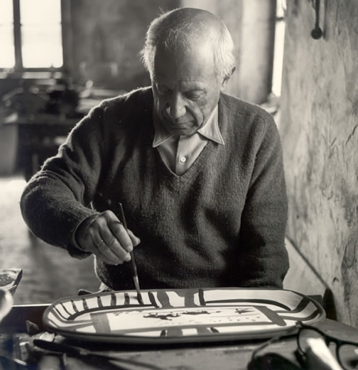
      Picasso Glazing a Platter


      Most artists keep sketchbooks in which they experiment with ideas and collect drawings of their environment. Sketchbooks are like visual diaries for artists. Artists often use them for planning and developing their work.

      Picasso Produced Over 178 Sketchbooks


      Use Your Imagination


      Each Friday you will have a binder entry due. The purpose of this is for you to plan, share and reflect on your art learning and making processes.


      You may choose to enter the information in your binder or on your blog. The entries need to include the following:
      • Daily art prompts- 2-3 sentences and/or drawings minimum for each question in the prompt.
      • Notes and research for the assignment with images related to the assignment cut out of magazines or found online and put on your blog 
      • Glaze records (if applicable this week)
      • Sketches for the current project to include
        Drawings, a plan including how you will make it and what surface decoration you will use. You may also include printed images.
      • Rubrics for the assignments


      • See Art Critic and Binder/Blog Entries for this week's prompts and to help with your research.

      Thursday, July 25, 2013

      Pottery

      Welcome Pottery 1 & 2 Students
      We will be using this blog to communicate.  You will look up assignments, research artists and use it as a springboard for your own blog portfolio.


      • Projects 
      • Binder/Blog Entries
      • Art Critic Commentary


      http://www.charlieparkerpottery.com/
      Moroccan Pottery
       

      Art Critic


      Art Critic Responses: 

      One of the standards: Envision and Critique to Reflect,  allows students to create and use a  visual vocabulary.  The Art Critic element of the Pottery classes is designed to encourage a class-wide discussion regarding  the elements and principles of design, techniques, skills and ways in which artists utilize these to facilitate their visual communication .  

      Students will be presented with a new artwork at the beginning of each class week and will be expected to write a full paragraph response to the weekly prompt.  Discussion and reactions to classmate posts are encouraged/expected.  The purpose of this blog is to encourage open dialogue and will be a factor in grading.  Please keep all comments positive and courteous. Please use complete sentences and proper grammar.   It is suggested that you first type your response in Microsoft Word, perform a spell-check, and then paste your response.


      Response 1: Week of 8-26-13
       

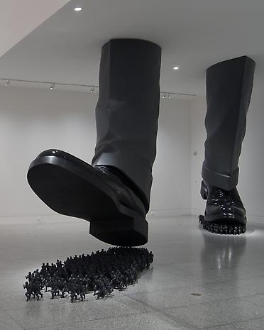
      Do Ho Suh, Karma, 2003
      Please post a full paragraph discussing the sculpture above. 
      1. What is your opinion of this sculpture?  (Please do not use simple answers like, "It sucks, or, "I like it".) Use the art elements and principles below. 
      2. Do you feel that the artist was attempting to communicate anything with this work?  If so, what? 
      3. Be specific, develop your answers and feel free to respond to your classmates’ posts.
      Evaluation of the post is based on the following parts of Art Criticism: Understands and applies the art criticism process to their work and the works of others
            Describing 

                 using the elements- line, shape, space, color, form, value, and texture    
           Analyzing

                 principles-pattern, contrast, balance, rhythm, movement, unity
                 how are the elements used through the principles
           Interpreting-
                 hypothesizing about what  the artist is trying to say, what is the mood, theme?
            Judging- 
                evaluating- was the artist successful in creating a mood or theme, why or why not?

      Use the Elements of Art and Principles of Design to help you:
      See this website or see below. 
      http://flyeschool.com/content/elements-artdesign-and-principles-designorganization

      Elements of Art 
       · Color: primary, secondary, tertiary, intermediate, analogous and monochromatic, intensity tones, warm and cool
      · Form:
      geometric, e.g. rectangular prisms, pyramids, triangular prisms, cubes, cones, spheres, and cylinder   organic forms: no angles
      · Line:
      continuous, vertical, horizontal, diagonal, curved, broken, implied, horizon line, parallel, perpendicular,intersecting, contour
      · Shape: geometric and organic, positive and negative, relational, opened and closed
      · Space: foreground, background, middle, overlapping, proportion, positive and negative, high/low placement
      · Texture:implied and actual
      · Value:lightness and darkness

      Principles of Design 
      · Balance (symmetrical, radial, asymmetrical)
      · Contrast (big/small, light/dark)
      · Emphasis/focal point
      · Movement (sequential, optical, actual, and implied)
      · Pattern/repetition (geometric, organic, ordered, symmetrical, asymmetrical, etc.)
      · Rhythm (repetition, alternation or progression)
      · Unity (cohesiveness or oneness, harmony).

      DIRECTIONS FOR RESPONDING TO POSTS ON THIS BLOG


      TO RESPOND TO POST:

      1) Read the information about the artist/look at the pictures.

      2) Type your responses in a Word document - spell check and save!!!!!

      3) Scroll down and click on “Comments” button – this will take you to the “Comments” screen

      4) Paste your responses in the box on the right - each response must be at least 5 sentences long for full credit!

      5) Make sure you write your name in the response box – or you won’t receive credit!!!! -

      6) Scroll down and click on “Anonymous”

      7) Click “Publish your comment”

      8) YOU MUST SEE THE YELLOW BAR AT THE TOP OF THE PAGE THAT SAYS: "Your comment has been saved and will be submitted for blog owner approval." - IF YOU DON'T SEE THIS YELLOW BAR, RESUBMIT YOUR RESPONSE!!! 


      Tuesday, November 20, 2012

      AP Studio Art 3D Design Breadth 6


      AP 3 D Design: Breadth 6:  Identity Architecture: Plaster casts of simple iconic building forms embedded with industrial or organic materials . An altar about you. Architecture from your childhood: a fort, a tree house, a decaying house…Maybe  you will reference a  Life Changing Experience: have you ever wondered if there was a significant experience that changed you. Someone whom you may have lost, a Grand Canyon river experience, a time when you were graced and survived a situation.


      Reading/Blog: SS: 225


      Blog2: Students must write a short proposal explaining what they would like to focus on for the concentration portion of the class. 

      Concentration Info:

      •    You must create 15- 20 pieces of artwork utilizing the theme that you select
      •    These pieces must show a progression and discovery both thematically and technically.
      •    You must keep a weekly Blog log of your progress, discoveries, struggles, etc.

      The work selected for your final “concentration portfolio” should be your best work Think of this as you would a scientific experiment/investigation – your will start off as a hypothesis and your idea may further develop throughout your investigation – your work should show a process or maturity and discovery


      Materials that could be used


      Clay

      Leathers

      Feathers

      Metal

      Straw

      Fabric

      Wood

      Glass

      Paper

      Photographs

      Plastic


      AP Studio Art Drawing Breadth 8


      AP Drawing  Breadth # 8 Lesson: A Day in the life of me, my Everyday World

      Objectives:

      Students will explore the idea of identity in their everyday lives by taking an old photograph and slightly abstracting it into an art piece.

      Students will apply methods of abstraction

      Blog: Browse the book: http://books.google.com/books?id=GbhZ-fd8kroC&dq=composition+in+art&printsec=frontcover&source=bl&ots=67FAejsnlA&sig=2PwBkP5ZlGsuKtPnOnDCOB2-bgM&hl=en&ei=lqnvStvTOY30sQO4qfnyBQ&sa=X&oi=book_result&ct=result&resnum=5&ved=0CBoQ6AEwBA#v=onepage&q=&f=false

      Make comments on what you learned about composition in your blog

      Sketchbook: Do 10 thumbnails of the compositon for your final piece in your sb.


      Gerard Richter
      Liebespaar im Wald
      Lovers in the Forest
      1966
      Oil on canvas
      http://www.gerhard-richter.com/art/paintings/


      Robert Longo
      Untitled (Puncher)
      1978
      Charcoal and graphite on paper
      http://www.robertlongo.com/work/gallery/1122


      Project PORTRAIT COMPOSITION: Paint or draw an abstraction from an old family or personal photo paying special attention to issues of VALUE and EMPHASIS..

      AP Studio Art Drawing Breadth 7

      Landscape Painting in Oil
      Alyssa Behne, AP student

      Thursday, November 1, 2012

      AP Studio Art 3D Breadth 5

      Idenity Self-Portrait: see the power point on the website:
      https://sites.google.com/a/adams12.org/dowlingpottery1/  under the identity file.


      Robert Arneson

      Watch this video:

      http://www.sfmoma.org/explore/multimedia/interactive_features/5#

      Monday, October 15, 2012

      AP Drawing Breadth 6, Juxtaposition


      Juxtaposition is collage, which means placing one image in the context of another. Juxtaposition can also mean relating one idea to another; this is conceptual collage. In both cases, the juxtaposition constructs meaning by setting up a relationship between the entities that are put together. This is a relationship based on a shared concept. When we see these entities together we search for and discover that concept that links them.
       
      Assignment:
      Create a work of art related to an unusual juxtaposition. Consider concepts and items that normally wouldn’t be seen together. Look at the surrealists and modern day illusionists for ideas. Remember that according to André Breton, who published "The Surrealist Manifesto" in 1924, Surrealism was a means of reuniting conscious and unconscious realms of experience so completely, that the world of dream and fantasy would be joined to the everyday rational world in "an absolute reality, a surreality." Surrealism and juxtaposition art also plays with scale and emphasis, making the relationship between objects unusual and out of normal scale.


      Student Concentration using juxtaposition
      http://apstudioartatwoodstock.blogspot.com/2011/11/concentration-surreal-juxtaposition.html


      Juxtaposition: Joining two or more images to create a new image.


      AP 3D Breadth 4 Juxtaposition


      Juxtaposition
      How does the juxtaposition of materials in an art work create meaning?


      Assignment: Use juxtaposition to create a unique ceramic or mixed-media art piece.
      Reading: Shaping Space pp. 28-33

      Look at the images and video (links) below to see examples of juxtaposition.


      Surrealism-

      a 20th-century avant-garde movement in art and literature that sought to release the creative potential of the unconscious mind, for example by the irrational juxtaposition of images.
       
      Juxtaposition refers to an act or instance of placing properties together, especially for the purpose of comparison or contrast. Beyond creating visually interesting effects, such juxtaposition brings different trains of thought into relation and creates debate. The nature and outcomes of such debate can be shaped by the artist’s choices, although as an approach commonly used in Postmodern art, such debate rarely declares a distinct point of view. http://vimeo.com/14264324

      Meret Oppenheim's, Fur Cup was created in the art period of Surrealism and represents juxtaposing various materials but also the idea of the odd sensation it would be to drink out of a fur cup

      Scroll to the video below:
      http://www.moma.org/collection/browse_results.php?criteria=O%3AAD%3AE%3A4416&page_number=1&template_id=1&sort_order=1


      Michelle Taylor modern version's of Meret Oppenheim's cup


      Generic product 1     Modern Philatories   Brad Bachmeier
      The familiar image of the UPC bar code on this hand-made wheel-thrown ceramic vessel creates an immediate and ironic juxtaposition. In the vocabulary of this body of work, the modern symbol hints at commercialism, marketing and consumerism as well as setting forth questions about the application of this artificial symbol on this organic matter implying deeper impositions of technological advances.

       Modern Philatories
      This vessel form uses the ancient term philatory, a word used to describe a niche which contains something sacred while allowing you to see the object. In this case we are peering at three human moral plagues in modern forms, namely: Power, Possessions and Pleasure. The figurative element to the vessel provides both a personal and generalized human attachment to these large issues. The Golem-like figure illustrates how mindlessly human motivations and actions can be considered.
       
       
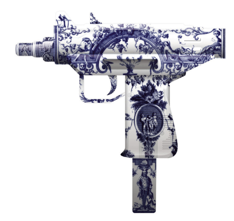
       Magnus Gjoen’s  shows the juxtaposition between the beautiful and the destructive or undesirable.
       
      Ai Wei Wei
       
       
      Roberto Lugo
       
                                     
      “Weight Loss Attempt Via Suicide with A Toy Gun”
       
      Carlos Dye
       
       
      Constructing personal narratives through popular imagery based on memories of my life, and dreams is the foundation of my work. In my work there is angst, happiness, temptation, and sorrow that I transcribe through iconography, and symbolism. The illustrations displayed in my work creates a natural confusion for the viewer when juxtaposed among conflicting images. This illusory approach creates consonance for the viewer.


      Tuesday, October 2, 2012

      AP Drawing Breadth 5


      AP Drawing Breadth #5 Line and Emotion  


      Reading/Blog: DCA, pp 52-66, Chapter 5, Colston 86-87 scan a childhood drawing scan the sketchbook drawing and comment on the experience and add to your blog.

      Sketchbook: Recreate a childhood photo using one of the types of line described in Drawing:  a Contemporary Approach chapter 5.     Think about how you felt at the time the photo was taken. Were you happy? The lines might be Lyrical: twirly and light.  Angry?  The lines might be Constricted/Aggressive : heavy and strong.  Shy?  Calligraphic. Do the exercises on 132-134 before you tackle the drawing.                                             

      Project: Create a self portrait today using the same idea as the sketchbook assignment.

      ·         We can take your portrait and edit it in Photoshop but also use the mirror as reference and set up a light.

      ·         Do 10 or more thumbnail sketches to work out the composition.  Where are you on the picture plane?

      ·         Begin with creating several contour line drawings (p. 125) on newsprint using a felt tipped pen. Remember to show a light source with thin and thick lines.

      ·         Choose one contour line drawing and fill with cross-contour lines using the felt tip pen. (p. 129). Remember to show a light source with thin and thick lines

      ·         Begin sketching your final drawing with pencil very lightly. Add the light source.

      ·         Fill at least 90% of the 18 x 24 inch page with your portrait.

      ·         Choose your medium: charcoal, sharpie or conte crayon

      ·         Test out the medium with mark making different lines on paper

      ·         Add your lines

      · Spray with fixative and prepare for presentation